

Bianelle


Designed a complete visual identity system for Bianelle, a shapewear and intimates brand rooted in body positivity, targeting direct-to-consumer founders in the wellness apparel space.
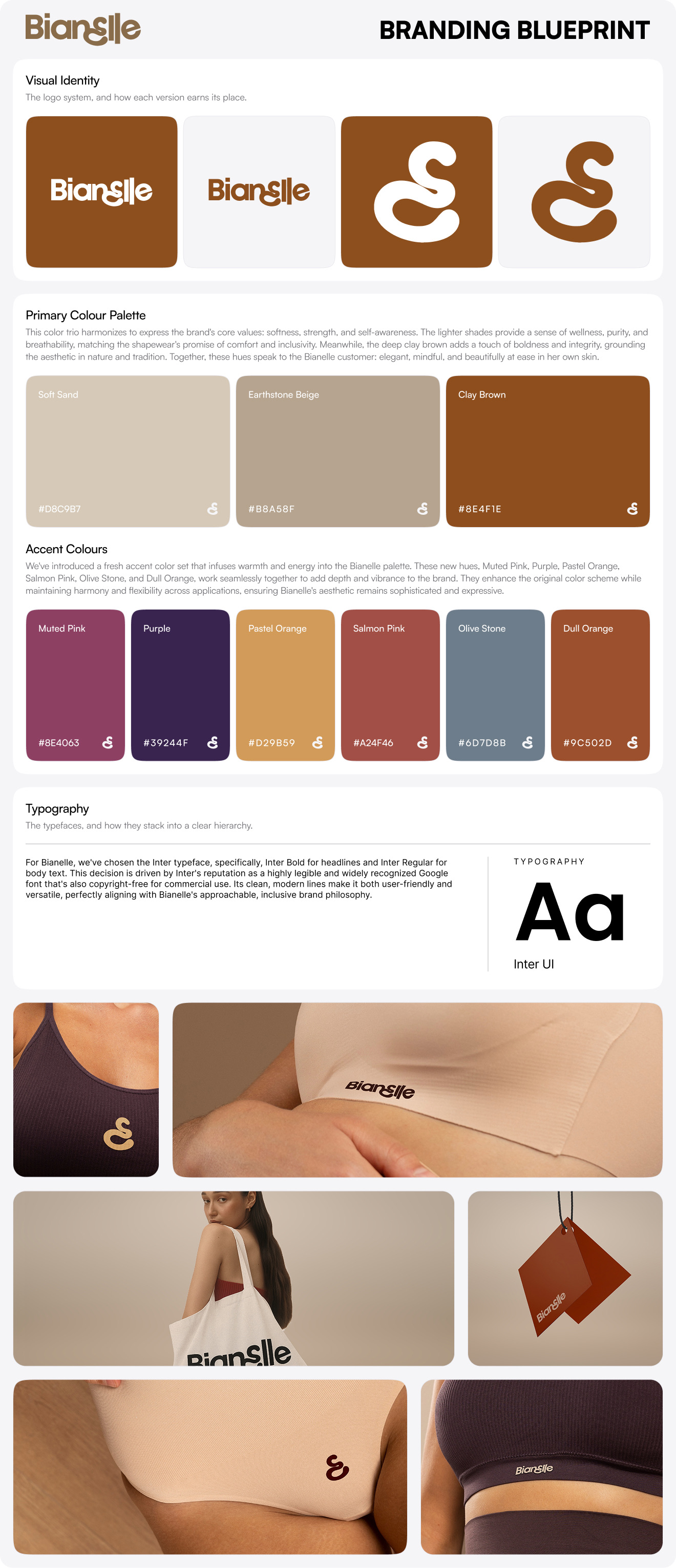
Bianelle is a shapewear and intimates brand built around mindful movement, comfort, and inclusive beauty, a category where the identity can't just live on a screen. It has to survive the jump to physical product: embroidered on a waistband, printed against bare skin, woven into a hang tag, and reproduced across fabrics and colorways that shift with every SKU. The design challenge was building a mark that works as both a meaningful symbol and a flexible production asset, carrying a message of body diversity that the shapewear category often handles clumsily, while staying legible everywhere it lands.
The system is anchored by a custom mnemonic: a stylized "e" sitting at the center of the wordmark. Its fluid, organic curves reference the contour and flexibility of the body, so the brand's core idea is built into the letterform itself rather than bolted on as a tagline. The mark does double duty, embedded in the wordmark it reads cleanly as an "e", but pulled out as a standalone icon its shape resolves into a "b", a quiet nod back to the brand name. That duality lets one asset flex from full wordmark to garment-tag icon without losing its connection to the identity. The custom "Bianelle" lettering wraps around it, and the system extends into primary and secondary lockups, wordmark alone, and wordmark stacked with the mnemonic, so there's a correct mark for every footprint, from a shopping bag to a woven label.
The color architecture is where the identity earns its keep on physical product. Rather than treating brand colors as accents only, every primary and secondary tone, Soft Sand, Earthstone Beige, Clay Brown, Muted Chestnut, Olive Stone, Deep Forest, is specified to work equally as a logo color and a background. That means the mark can sit on any garment, any fabric, any product context and still hold contrast and elegance, with a separate digital accent set adding warmth for web applications. Inter handles all system typography, keeping the type layer clean and copyright-free for commercial use, and a dedicated incorrect-usage section locks down the guardrails, no stretching, no shadows, no font substitution, no low-contrast placement, so the mark stays consistent once it's out of the studio and into production. Application mockups close the deck by proving the system in situ: tote bags, premium shopping bags, hang tags, and the logo printed directly onto shapewear against a range of skin tones.
The finished system gives a founder an identity that behaves the same on a landing page and on a waistband. It drops onto any product, any colorway, and any skin tone without a redraw, doing brand work and production work at the same time, signalling inclusivity through the form while flexing across an entire apparel line. A founder taking this to a manufacturer or a marketplace has a mark that's ready for both the storefront and the seam.
If you need a brand identity that has to live on a physical product as much as a screen, book a call with us today.