MotoCorp


Designed a complete brand identity and collateral system for MotoCorp, a car dealership specializing in high-end Japanese sport cars, targeting performance-car buyers and the dealership's own retail and merchandise operations.
MotoCorp is a car dealership built around high-end, luxurious Japanese sport cars, a retail category where the brand has to feel as fast and premium as the product on the forecourt. A dealership brand lives almost entirely on physical touchpoints: the cars themselves, the showroom, the staff uniforms, the paperwork a buyer signs, the merch that goes home with them. The design challenge was building an identity with enough energy to signal performance and enough discipline to stay consistent and legible across that entire spread, from a vehicle wrap moving at speed to a business card sitting on a desk, without the motorsport attitude tipping into noise.
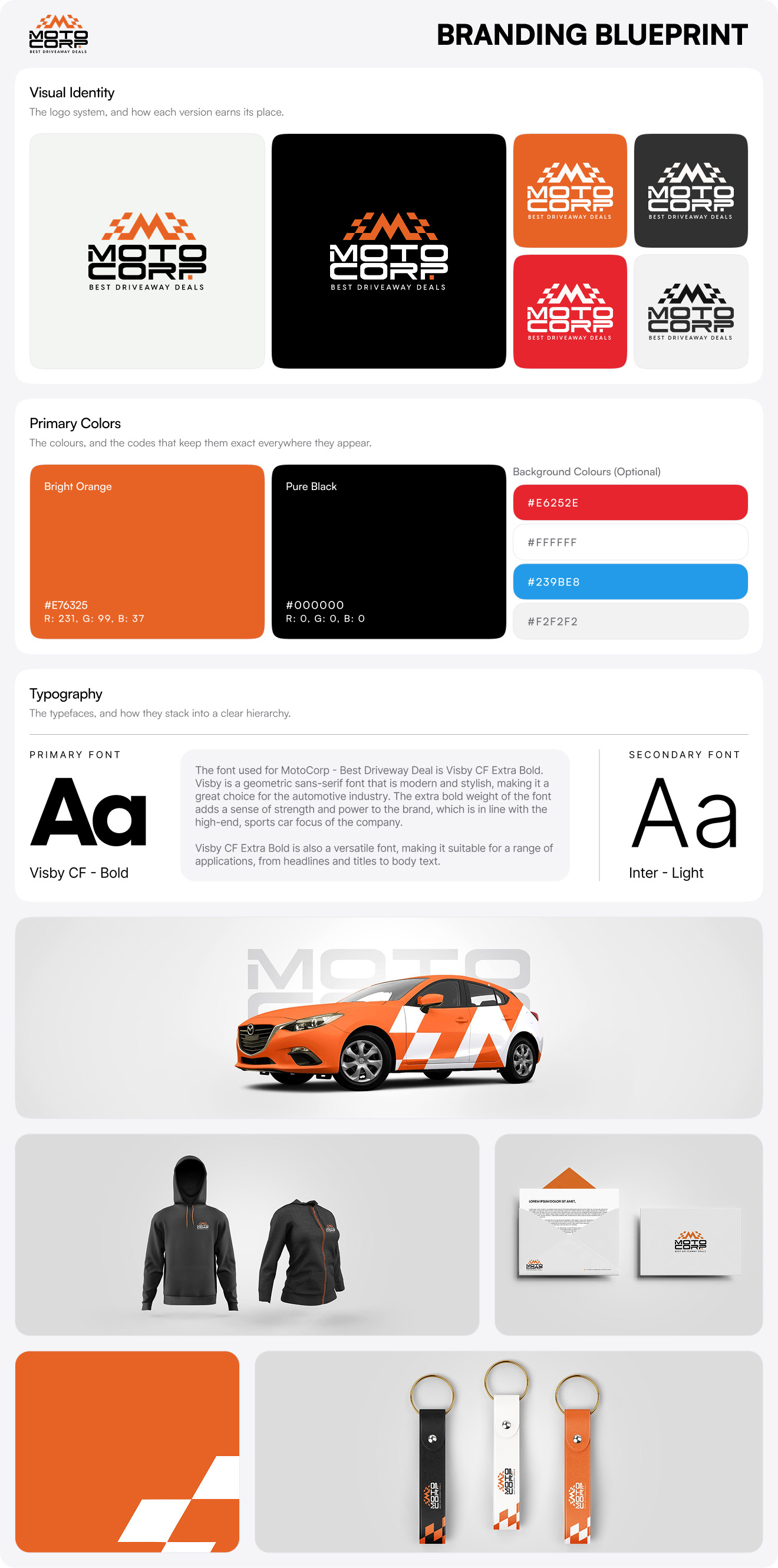
The identity is anchored by a custom "M" mnemonic built from sharp, angular lines and a checkered-flag motif, motorsport vocabulary encoded directly into the mark so the category reads instantly. The mnemonic stacks above a clean, bold "MOTOCORP" wordmark and the "Best Driveaway Deals" slogan, giving the system three components that can travel together as the full lockup or break apart, the M alone works as a compact icon for tight applications like pen barrels and key tags. A full variant set keeps it flexible across every surface: black-and-white for single-color printing, orange-and-white, orange-and-black, and light-blue-and-white, each tuned for a different background and context. Clear-space rules (a minimum of half the logo's height on all sides), placement guidance, and a misuse section lock down the guardrails, no distortion, no gradients, no unapproved colors, no off-angle placement, so the mark holds up wherever it's applied.
The color and type systems carry the performance tone without losing control. A two-color core of Bright Orange and Pure Black does the heavy lifting, orange for energy and excitement, black for sophistication and authority, backed by a wider background set (Dull White, Bright Red, Light Blue) for flexibility across digital and print. Visby CF Extra Bold serves as the primary typeface, its geometric weight matching the high-end sports-car focus, with Inter Light handling body copy for legibility at small sizes. The angular checkered-flag pattern recurs as a system-wide graphic device, tying every piece together. The collateral program then proves the system in the real world across the full dealership operation: vehicle wraps, business cards, letterhead, file folders, envelopes, branded pens, social media templates with model spec callouts, and a merch line spanning hoodies, polos, caps, mugs, and key tags.
The finished system gives a dealership one coherent identity that performs from the forecourt to the front desk. A buyer sees the same brand on the wrapped car they're test-driving, the spec sheet in their inbox, the folder their paperwork comes in, and the cap they walk away with, every touchpoint reinforcing the same high-performance, premium feel. The dealership gets a kit that's ready to deploy across retail, marketing, and merch without a designer needed at every step.
If you need a brand identity with the energy to signal performance and the discipline to stay consistent across an entire retail and merch operation, book a call with us today.