Orban Properties


Designed a brand identity and guidelines system for Orban Properties, a real estate and property company, targeting prospective buyers, tenants, and property investors.
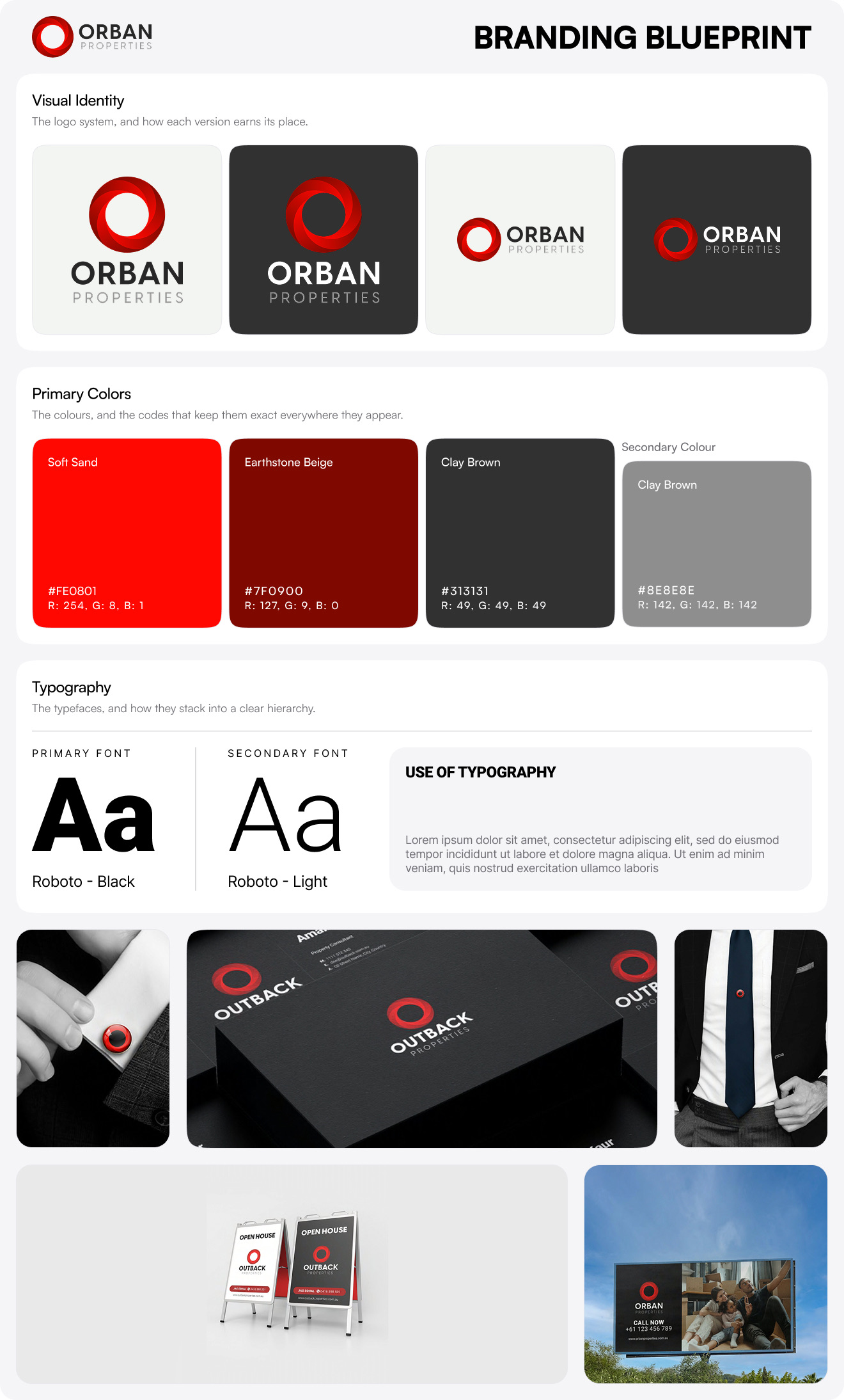
Orban Properties is a real estate and property company whose business rests on long term client relationships, the kind where trust compounds over years rather than single transactions. The brand needed an identity that made that promise visible at a glance, a mark that signalled permanence and reliability without reading as cold or corporate. The design challenge was translating an intangible value, a lifelong business relationship, into a symbol concrete enough to anchor a full identity system across digital and physical touchpoints.
The identity is built around an elliptical mnemonic drawn as a continuous spiral, a form that reads as an infinite loop to represent the never ending bond between the organisation and its customers. A red gradient runs through the icon, signalling energy and the breadth of clients the company serves, while keeping the mark feeling premium rather than flat. The wordmark pairs a bold, geometric primary typeface for the Orban name with a lighter, spaced treatment for the Properties descriptor, giving the lockup a confident, modern balance. A defined colour system spans bright red and deep maroon as primaries, with steel grey and a sophisticated black supporting them, each colour assigned a specific role in how the brand presents focus, balance, and professionalism.
The guidelines document the full system end to end: the mnemonic and wordmark construction, clear space and minimum size rules for digital and print, an approved set of background colours that keep the logo versatile across light and dark grounds, a misuse section that rules out distortion, incorrect gradients, and unapproved effects, and a complete colour reference with HEX, RGB, and CMYK values. The system extends into application with an app icon treatment and favicon, so the brand holds together from a website header down to a mobile home screen. Together they give Orban Properties a disciplined, trustworthy identity that scales cleanly across every place a property buyer or investor encounters it.
If you need a brand identity and guidelines system that turns a relationship driven business into a mark people instantly trust, book a call with us today.