
Port City Colombo


Designed a master-brand identity and architecture system for Colombo Port City Special Economic Zone, a flagship urban-development and investment megaproject in Sri Lanka, targeting international investors, businesses, and government stakeholders.
Colombo Port City is a special economic zone being built on reclaimed land off Colombo, a city-scale development that has to speak to international investors, businesses setting up inside the zone, future residents, and the state-backed developer entity all at once. A brand at this scale isn't a single logo; it's a system that has to sit at the top of a hierarchy and govern everything beneath it. The design challenge was building a master brand flexible enough to spawn a controlled family of sub-brands, business, lifestyle, sustainability, and coexist with a trilingual developer lockup, while holding consistency from a glass building facade down to a printed impact-assessment report, across multiple languages and a tonal range from civic-vibrant to premium-financial, without the system fragmenting once it left the studio.
The system is anchored by a single emblem: intertwining lines forming leaf-like petals around a horizon, reading as the harmony between commerce and living that defines the zone, with a blue-to-purple-to-pink spectrum nodding to the coastal location. From there the work is pure brand architecture. Port City Colombo is established as the mother brand, positioned, by design, at the top of the hierarchy as the reference point for the development as a whole, and three sub-brand extensions branch from it, each holding the same emblem structure while swapping a controlled color and wordmark: blue for the Special Economic Zone (business), pink-red for Living & Lifestyle, green for Sustainability ESG. A separate, governed lockup handles the developer entity, CHEC Port City Colombo Pvt Ltd, in a trilingual English-Chinese configuration with its own proportion rules so it reads cleanly alongside the master brand rather than competing with it.
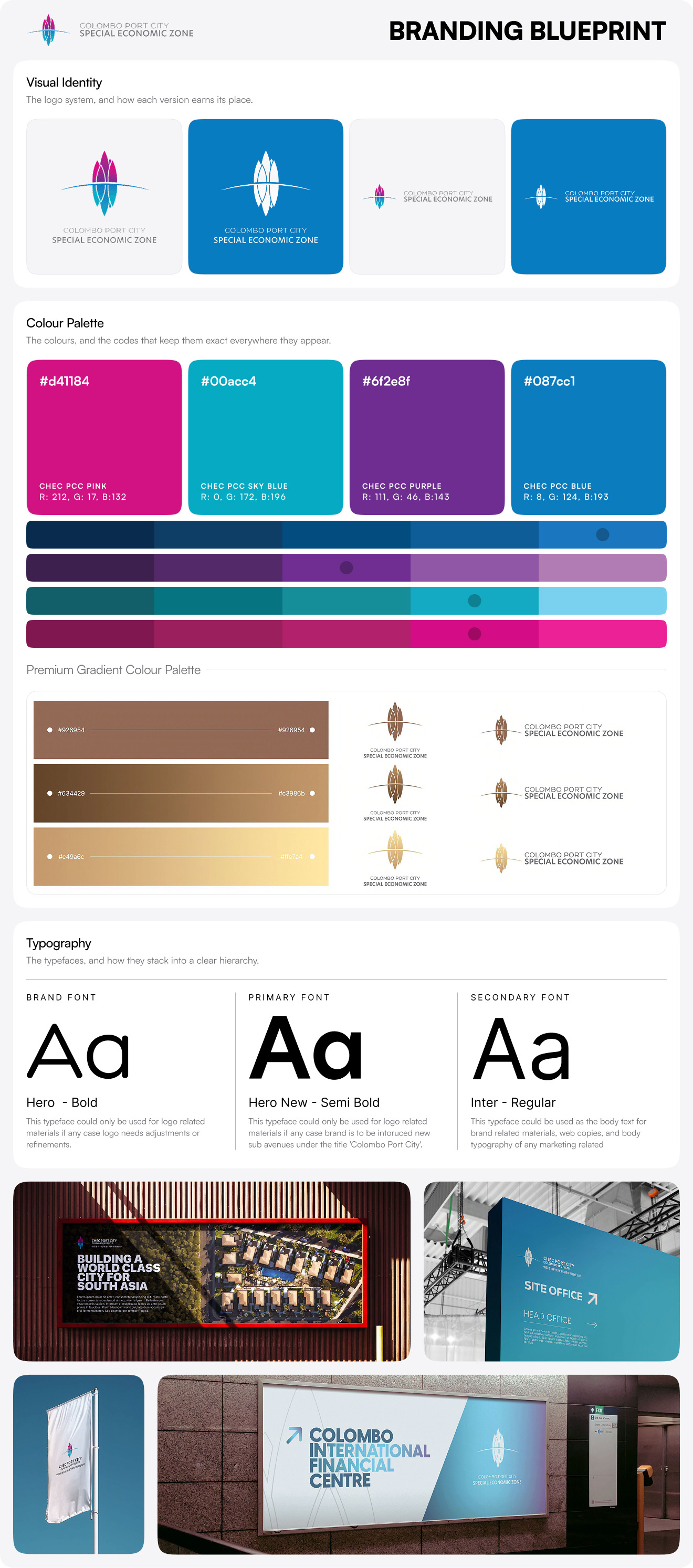
The color and usage layers are where the system earns its durability across so many contexts. Beyond the vibrant primary palette (PCC Pink, Sky Blue, Purple, Blue) and its gradient extensions, the system specifies a premium palette in two registers, solid earth tones and metallic bronze-and-gold gradients, so the same mark can shift from civic energy to the prestige tone a financial centre or investor document demands. A full variation matrix governs the rest: text-based lockups (primary, secondary, positive and negative monochrome), color-based rules keyed to background lightness thresholds, recommended and minimum sizing (30mm down to 10mm), clear-space defined by the wordmark itself, and explicit creative-symbol rules permitting cropping and 3D extrusion of the mark while ruling out bevels and distortion. Hero New serves as the brand typeface, Bold reserved for logo refinement, Semi Bold for headlines, backed by Inter and Open Sans for accessible body copy. A consistent misuse section locks every variant against distortion, unapproved gradients, effects, and off-angle placement.
The finished system lets one emblem govern an entire city's worth of communications. An investor reading a bound impact assessment, a contractor reading site-office signage, and a marketing team building an expo flag are each working from a defined, correct asset that traces back to the same master brand, across three sub-brands, two-plus languages, and the full range from vibrant civic to premium financial. The architecture does the governance work so the brand holds together no matter who is applying it or where it lands.
If you need a master-brand system that has to govern a whole ecosystem of sub-brands, stakeholders, and languages without fragmenting, book a call with us today.