
Roughton Int.


Designed a comprehensive brand identity and guidelines system for Roughton International, a global engineering and construction consultancy with six decades of history, targeting governments, private enterprises, and international development agencies.
Roughton International is an engineering and construction consultancy with a sixty year history and a global footprint stretching from Africa to Asia, serving governments, private enterprises, and international bodies on large scale infrastructure projects. A firm with that depth of track record needed an identity that signalled stability and trust to institutional clients, while still feeling forward looking enough to match a brand that positions itself as a catalyst for sustainable transformation. The design challenge was balancing the weight of a six decade legacy with a contemporary, sustainability led brand story, then carrying that balance consistently across one of the broadest application sets a consultancy brand has to cover, from World Bank report covers to corporate ID lanyards.
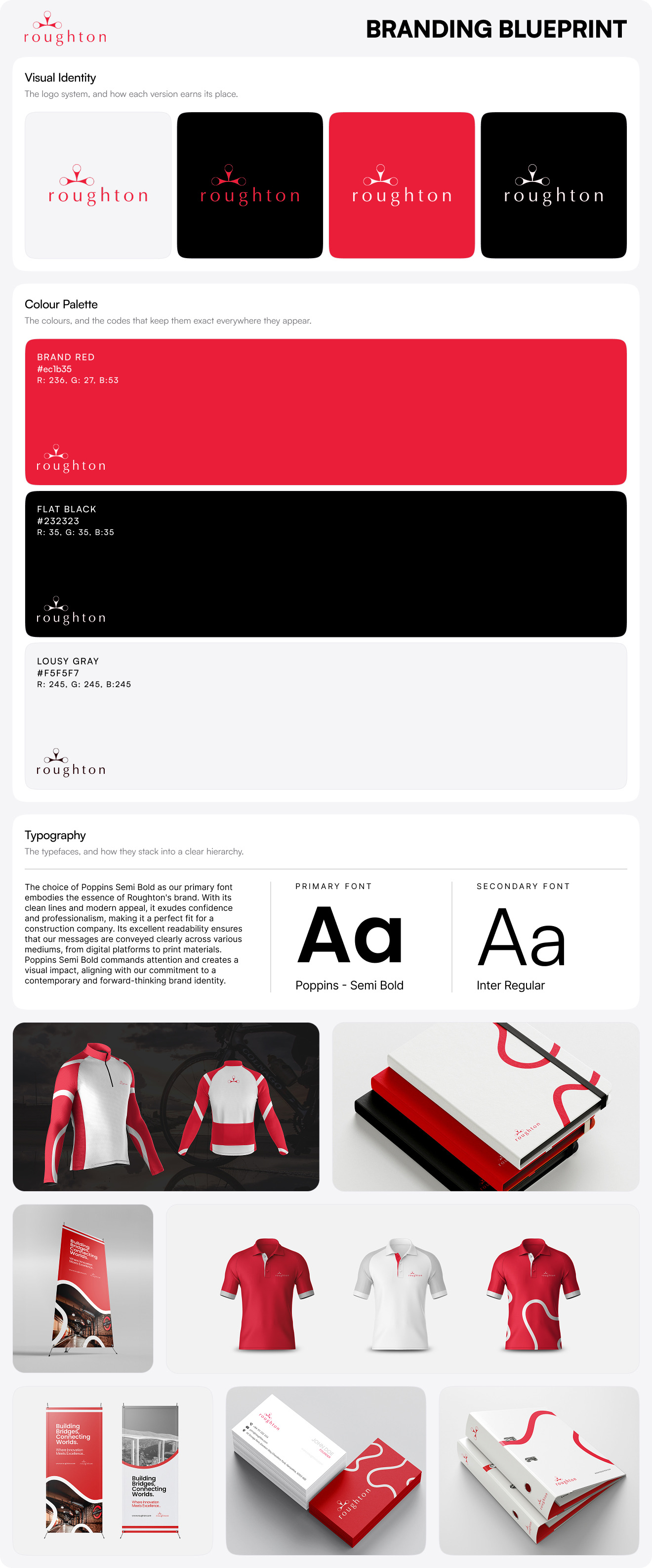
The identity is anchored by a distinctive wordmark in which a stylised node and connector mark rises out of the lettering, a form that reads as connection, partnership, and the linking of places that defines infrastructure work. Bright red carries the brand as a signal of strength, determination, and reliability, supported by a pastel black for sophistication and a gray white for neutrality and balance, with a deeper maroon reserved to mark the firm's commitment to sustainability. A flowing white line pattern, drawn as continuous abstract curves, runs through the system as a visual signature, echoing the bridges and routes the company builds. Poppins Semi Bold leads the typography for confidence and clarity, with Inter Regular handling the longer technical copy a consultancy produces.
The guidelines are exhaustive, built to govern the brand end to end. A brand pyramid and vision section define essence, personality, and emotional and functional benefits before a single logo rule appears. The visual identity section covers clearspace, minimum sizes, colour variations, a full misuse set, and placement principles. From there the system extends across a wide application suite: business cards, email signatures, letterhead, envelopes, file folders, roll up banners, social media kits, branded merchandise including polos and a cycling jersey, paper bags, corporate ID and lanyards, an architectural photography style, and a complete document family spanning report covers, inner pages, project sheets, service sheets, CV templates, presentation decks, and CD labels, several co branded with partners like Foster + Partners and the World Bank. Together they give Roughton a disciplined, institution grade identity that holds its authority whether it lands on a tender document or a conference floor.
If you need a brand identity and guidelines system robust enough to govern a global firm across every document, surface, and touchpoint it operates on, book a call with us today.